
01 Mar The Psychology of Color: Using Holi’s Palette in Your Brand’s Visual Identity
Imagine walking into a room painted entirely red. How do you feel? Now imagine that same room, but it’s painted soft blue. Different, right? You haven’t moved. The furniture hasn’t changed. The people are the same. But something shifted inside you. That’s not magic—that’s color psychology.
Now think about Holi. What comes to mind? Probably chaos. Laughter. Wet clothes. Stained skin. And above all, an explosion of color so intense it feels like the rainbow exploded. But here’s what most people miss: Holi isn’t random. Every color thrown during the festival carries meaning. Centuries of tradition. Layers of symbolism. Stories baked into every shade.
And that? That’s exactly what smart brands do with their visual identity. They don’t pick colors because they “look pretty.” They pick colors because those colors carry meaning. They tap into feelings you didn’t even know you had.
So let’s smash the two together. Let’s take Holi’s palette—those vibrant, chaotic, beautiful colors—and ask what they can teach us about branding. Because if you understand why Holi uses certain colors, you might just understand why your favorite brands use certain colors too.
Why Color Matters More Than You Think
Here’s a number that should stop you in your tracks: people form a first impression of products within 90 seconds, and up to 90% of that impression is based on color alone. Not the product quality. Not the price. Not the features. Color.
Your brain processes color faster than words. Faster than shapes. Faster than almost anything. Before you’ve even registered what you’re looking at, your gut has already decided whether it likes it. That’s wild when you think about it. Your brand’s color choice is working—or failing—before anyone reads a single word you wrote.
Different colors trigger different responses across cultures, but some patterns hold remarkably steady. Red speeds your heartbeat. Blue calms you down. Yellow wakes you up. Green grounds you. These aren’t marketing gimmicks—they’re biological reactions wired into your nervous system.
And Holi? Holi understood this centuries before scientists gave it a fancy name.
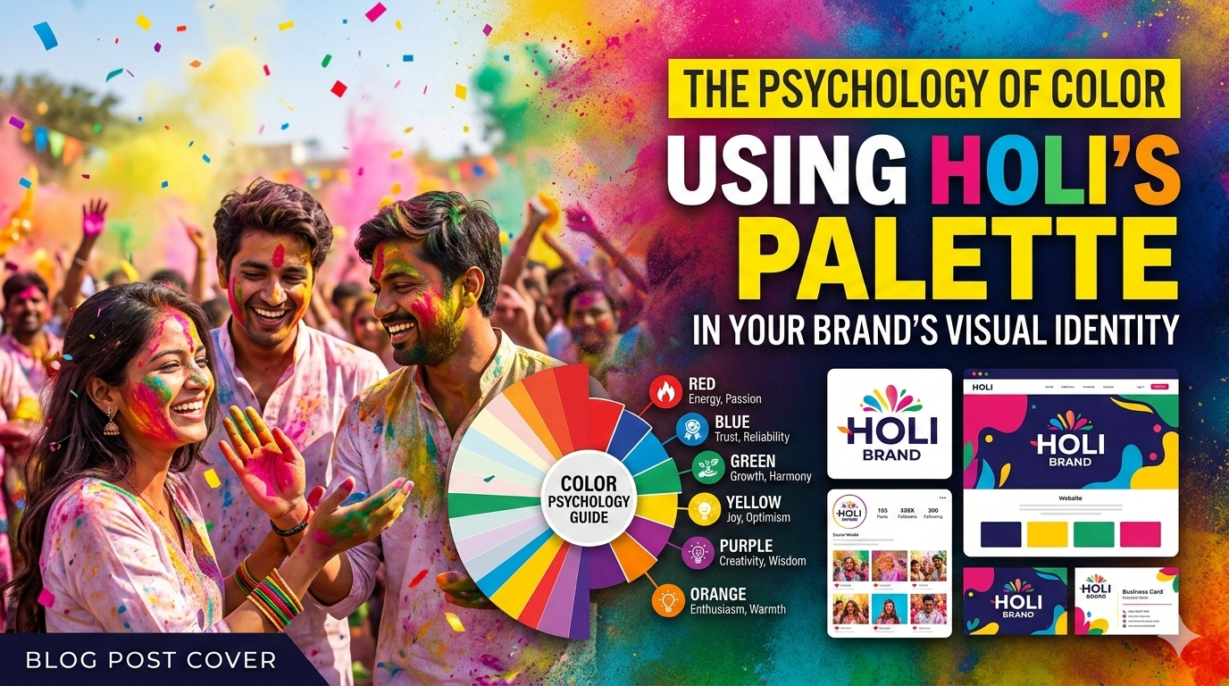
Red: The Color of Beginning and Boldness
Walk through Holi celebrations and red is everywhere. It stains clothes. It streaks faces. It marks the start of something.
In Hindu tradition, red represents auspicious beginnings. Marriage. Fertility. Life itself. It’s the color brides wear, the powder thrown first, the shade that demands attention. Red doesn’t whisper. It shouts.
Brands that use red understand this. Think Coca-Cola. Think Netflix. Think YouTube. These aren’t shy companies. They want you to look. They want your heart rate up. They want action—buy now, watch now, click now. Red is urgency dressed up as celebration.
If your brand wants to feel bold, passionate, or exciting, red belongs in your palette. But here’s the warning: red also triggers caution. Stop signs. Error messages. Sale tags that scream “limited time.” Use too much red and you’ll exhaust people. Use it right and they’ll move when you ask.
Holi teaches us that red isn’t just loud—it’s sacred. The best brand uses red like ceremony, not like screaming.
Blue: The Cool Escape
Holi has a blue problem, and it’s beautiful. Krishna’s skin is blue. The god of play, of mischief, of love—he’s blue. And during Holi, that blue gets thrown with abandon.
Blue means something different from red. It’s the sky. The ocean. The infinite. It calms rather than excites. It suggests depth rather than urgency. When Krishna stole butter and played with the gopis, he wasn’t rushing—he was enjoying.
Brands that use blue want you to trust them. Facebook. LinkedIn. PayPal. These aren companies asking for impulsive decisions. They’re handling your data, your money, your professional reputation. Blue says “relax, we’ve got this.”
But here’s what Holi understands that many brands miss: blue works because it contrasts with everything else. In the chaos of colors, blue is the moment of calm. In a feed full of red “BUY NOW” buttons, blue text might be the one thing people actually read.
If your brand sells trust, expertise, or stability, borrow from Krishna. Make blue your anchor. Let it ground people before you ask them to move.
Yellow: The Warm Awakener
Turmeric. Sunlight. Mustard fields. Holi without yellow would feel incomplete because yellow carries the festival’s warmth.
Yellow is knowledge in Hindu tradition. It’s the color of learning, of light, of things growing. It doesn’t shout like red or calm like blue—it wakes you up. It says “pay attention, something good is happening.”
Brands that use yellow well understand this. McDonald’s arches. IKEA catalogs. National Geographic borders. These brands aren’t urgent or particularly trustworthy in the blue sense. They’re happy. They’re optimistic. They’re the friend who calls you outside to see the sunset.
Yellow works because it triggers serotonin. It literally makes you feel happier to be alive. But here’s the catch: too much yellow feels cheap. It overwhelms. It strains eyes and triggers anxiety if overused. The best brands use yellow as an accent—a splash of sunshine, not a desert sun.
Holi uses yellow generously but never alone. It’s always balanced. Always part of a bigger picture. Your brand should do the same.
Green: The Grounding Force
Nature. New beginnings. Harvest. Green shows up during Holi as celebration of spring, of life returning to the world after winter’s gray.
In color psychology, green sits exactly in the middle of the spectrum. It’s the balance point. The eye doesn’t need to adjust to see green—it’s where we’re most comfortable. That’s not coincidence. We evolved surrounded by green. Our brains associate it with safety, with food, with survival.
Brands that use green want you to feel balanced too. Starbucks. Whole Foods. John Deere. These companies sell different things but promise similar feelings: natural, organic, sustainable, trustworthy. Green says “this won’t hurt you” better than any other color.
But Holi’s green isn’t just calm nature—it’s celebration of nature. It’s green thrown joyfully, not studied seriously. The best green brands understand this balance. They’re trustworthy without being boring. Reliable without being dull. They feel alive, not corporate.
If your brand sells wellness, sustainability, or simply peace of mind, green belongs somewhere in your palette. Let Holi remind you that green can also be playful.
Pink and Magenta: The Unexpected Joy
Walk through Holi and you’ll see shades that don’t exist in nature. Electric pinks. Neon magentas. Colors that shouldn’t work but absolutely do.
These colors don’t carry the same ancient symbolism as red or yellow. They’re newer. More modern. But they’ve become essential because they represent something important: joy without reason. Celebration without ritual. Fun for fun’s sake.
Brands that use pink and magenta well tap into this. T-Mobile’s magenta stands out in a sea of blue and red telecom competitors. Barbie’s pink isn’t subtle—it’s a statement. These colors say “we’re not like the others and we don’t want to be.”
If your brand targets younger audiences, creative industries, or anyone tired of corporate seriousness, consider these unexpected shades. They signal that you understand play. That you don’t take yourself too seriously. That joy is allowed.
The White Space Problem
Here’s what most brand conversations miss when they talk about color: they forget white.
Watch Holi celebrations closely. The most powerful moments aren’t when colors fly—they’re when someone untouched by color stands in the crowd. A white shirt. A clean face. That blank canvas makes every other color more intense by comparison.
White in Hindu tradition represents purity, peace, the canvas before creation begins. In branding, white space does the same thing. It’s not empty—it’s essential. It gives your colors room to breathe. It tells the eye where to look. It prevents chaos from becoming just noise.
Apple understood this. Google’s homepage understood this. The brands that feel “clean” and “modern” aren’t using less color—they’re using white as deliberately as they use their primary palette.
If your brand feels cluttered or chaotic, the solution might not be less color. It might be more white. More space. More room for the colors you do use to actually land.
How to Build Your Holi-Inspired Palette
So you’re sold. You want to borrow from Holi’s wisdom. Where do you actually start?
First, decide what you want people to feel. Not what you want them to do—buy, click, subscribe—but what you want them to feel while doing it. Excited? Calm? Trusting? Playful? Your answer determines your dominant color.
Second, pick your anchor. One color carries your primary emotional message. For Coca-Cola, it’s red. For IBM, it’s blue. For you, it’s whatever feeling matters most. This color shows up most often. It’s on your logo. It’s in your headers. It’s your identity.
Third, choose your accents. Holi never throws just one color. Neither should your brand. Pick 2-3 supporting colors that complement your anchor emotionally, not just visually. If your anchor is urgent red, maybe calm blue accents create balance. If your anchor is trustworthy blue, maybe playful pink accents add humanity.
Fourth, respect your white space. Decide how much emptiness your design needs. Build it into your templates. Protect it from content creep. Remember that white isn’t absence—it’s structure.
Finally, test. Colors look different on screens than in your head. They feel different to different audiences. Show your palette to people who aren’t you. Ask what they feel. Listen to the answers.
The Brands Doing This Right
Let’s look at some brands that understand this Holi-inspired approach, whether they know it or not.
Spotify uses a chaotic rainbow of colors in their playlists and campaigns. But watch closely—the chaos is structured. Green for fresh finds. Purple for chill vibes. Orange for high energy. They’ve mapped emotions to colors so consistently that you know what a playlist sounds like before you press play.
Nickelodeon built an entire brand around orange slime. It’s not a color you’d expect to work—it’s too specific, too weird—but it became unforgettable because it owned that shade completely. When you see Nickelodeon orange, you feel messy, playful, slightly gross joy. That’s Holi energy exactly.
Local brands do this too. Think of the restaurant with the turmeric-yellow walls that makes you feel warm before you taste the food. The yoga studio with the deep green lobby that calms you before class starts. The coffee shop with the red accent wall that makes you order faster than you planned.
These brands understood that color isn’t decoration. It’s communication.
The Cultural Respect Question
Before you rush to borrow from Holi, a quick pause. Using cultural elements in branding requires care. There’s a line between appreciation and appropriation, and smart brands know the difference.
Appreciation means understanding why the colors matter. It means honoring their meaning, not just their visual impact. It means giving credit, telling stories, and including voices from the culture you’re borrowing from.
Appropriation means grabbing colors because they look cool, stripping away their meaning, and using them without context or respect. It’s lazy. And audiences—especially younger, more aware audiences—can smell it from miles away.
If Holi’s palette inspires you, great. But take time to learn. Talk to people who grew up celebrating. Read about the traditions. Understand that red isn’t just “attention-grabbing”—it’s sacred. Blue isn’t just “trustworthy”—it’s divine. When you understand the depth, your brand’s use of these colors carries that depth too.
Testing Your Palette Before Holi
Here’s a fun exercise before you commit to anything. Run a Holi test.
Print your logo or your website homepage in grayscale. Now look at it. If it’s hard to understand, hard to navigate, hard to feel anything—you’re relying on color to do work that design should be doing. Fix the structure first, then add color back.
Next, show your color palette to five people and ask one question: “What does this make you feel?” Don’t guide them. Don’t explain. Just listen. If their answers match your intentions, you’re on the right track. If they say “corporate” when you wanted “playful,” go back to the drawing board.
Finally, imagine your brand at Holi. If your colors were thrown into the crowd, would they belong? Would they add to the joy or feel like an interruption? Would people smile when they saw your shade on their clothes later, or would they scrub it off?
That last question matters more than you think.
Conclusion
Holi teaches us that color isn’t surface—it’s substance. Every shade thrown during the festival carries meaning, history, and emotion. The chaos looks random, but it’s not. It’s structured by centuries of understanding what colors do to human hearts.
Your brand’s visual identity works the same way. The colors you choose aren’t just decoration. They’re doing work every second someone looks at them. They’re triggering feelings. Building associations. Creating impressions that words can’t touch.
The question isn’t whether your brand uses color psychology. Every brand does, whether they mean to or not. The question is whether you’re using it intentionally or leaving it to chance.
Holi’s palette offers a masterclass in intentional color. Red for beginnings. Blue for calm. Yellow for warmth. Green for balance. White for space. Each color doing specific work, creating specific feelings, building specific connections.
Your brand can learn from this. Pick your colors like Holi picks its powders—deliberately, joyfully, with full understanding of what they mean. Then throw them generously. Watch what happens. Adjust and throw again.
That’s not just branding. That’s celebration. And honestly? That’s the whole point.
Frequently Asked Questions (FAQs)
1. Can I use Holi’s colors in my branding if my brand isn’t connected to Indian culture?
Yes, but do it respectfully. The colors themselves are universal—red exists everywhere, blue exists everywhere. What matters is how you use them. Avoid superficial “Indian-inspired” designs that borrow without understanding. Focus on the emotional meanings that transcend culture—passion, calm, joy, growth—and let those guide your choices. If someone from the culture would feel honored rather than exploited by your use, you’re probably on the right track.
2. How many colors should my brand actually use?
Most successful brands stick to 3-5 core colors. One dominant color that carries your primary emotion. 2-3 supporting colors that add depth and flexibility. One neutral (white, gray, or black) that provides structure. More than that gets chaotic. Fewer than that feels flat. Holi uses many colors, but watch closely—they’re not all used equally. Some dominate. Some accent. Some only appear occasionally. Your palette should work the same way.
3. What if my favorite color sends the wrong message for my brand?
This hurts, but it’s real. You might love purple, but if you’re selling industrial equipment, purple probably isn’t serving you. Your brand isn’t about your personal preferences—it’s about your audience’s responses. Save your favorite color for your living room. Give your brand what it needs to connect with the people you’re trying to reach. There’s freedom in that separation. Your personal identity and your brand identity don’t have to match.
4. How often should I update my brand colors?
Less often than you think. Color associations build over time. If you change constantly, you never build recognition. Major rebrands happen every 5-10 years for most established companies. Smaller tweaks—shifting from bright red to deeper red—can happen more frequently. The key is evolution, not revolution. Your audience should feel “this feels fresh” not “wait, what happened?” Holi’s colors stay the same every year. The joy comes from how they’re used, not that they’re new.
5. Does color psychology work the same across all cultures?
No, and this is crucial. White means purity in many Western contexts. It means mourning in many Eastern contexts. Red means luck in China and danger in parts of Africa. If your brand reaches multiple cultures, research each one. Don’t assume your color choices translate. The best global brands often use different color strategies in different markets, or choose colors with more universal meanings. Green for nature. Blue for sky. These translate better than culturally specific associations.
No Comments