Let me ask you something. How much traffic are you driving to your landing pages? And how much of that traffic actually converts into leads or sales?
If you're like most digital marketing professionals and business owners, the answer is: "I'm getting traffic, but my conversion rate is disappointing." You're spending time and money driving people to your landing pages. But most visitors leave without taking action. And that's costing you.
Here's the truth: Great landing pages aren't accidents. They're engineered. They follow proven principles that guide visitors from "just browsing" to "ready to buy." In this guide, I'll break down the 12 elements that convert visitors into customers.
Whether you're a digital marketing professional, a business owner, or a student taking a digital marketing course, this is your blueprint for building landing pages that actually convert.
Let's dive in.
1. Why Landing Pages Matter More Than Your Homepage
Your homepage is for everyone. Your landing page is for one specific audience with one specific goal. Here's why that matters.
1.1 Focused Attention
A landing page removes distractions. There's no navigation menu, no competing links, no "about us" page. There's one message and one action. This focus dramatically increases conversion rates.
1.2 Message Match
A landing page can be tailored to the exact ad, email, or post that brought the visitor there. If your ad promises "50% off running shoes," your landing page should say the same thing. This continuity builds trust and reduces bounce rates.
1.3 Measurable Results
Landing pages are easy to test and optimize. You can A/B test headlines, images, CTAs, and more to see what works. This data-driven approach leads to continuous improvement.
2. The 12 Elements of a High-Converting Landing Page
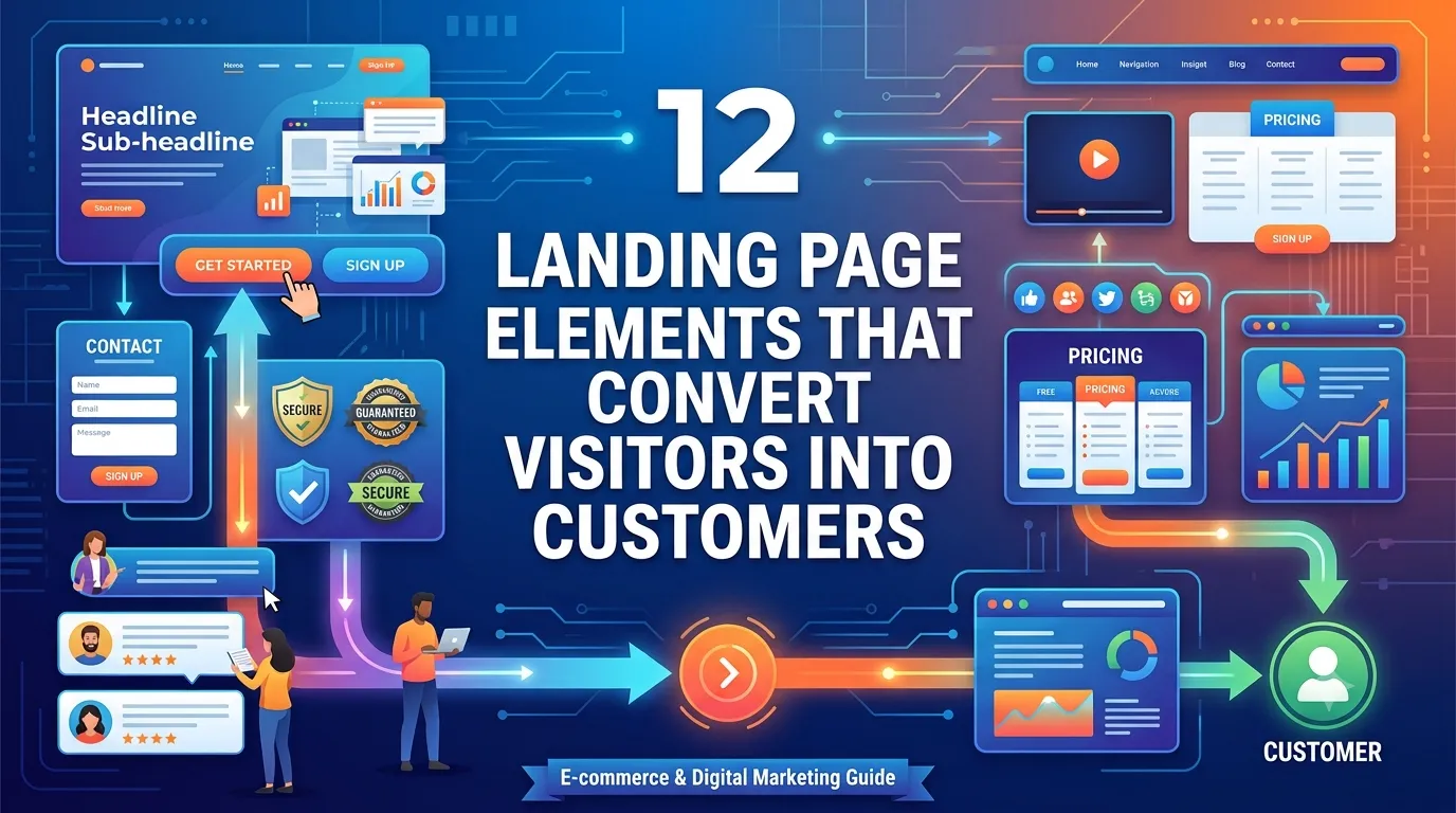
Here are the 12 elements that turn visitors into customers.
2.1 A Clear, Compelling Headline
Your headline is the first thing visitors see. It must grab attention and communicate the value of your offer in seconds.
- Focus on the benefit: "Double Your Leads in 30 Days"
- Be specific: "Get 100 Qualified Leads for $500"
- Create urgency: "Last Chance: 50% Off Ends Tonight"
- Use numbers: "7 Proven Ways to Increase Conversions"
Pro tip: Aim for 6-12 words. If your headline is longer, it's too long.
2.2 A Supporting Subheadline
The subheadline expands on the headline. It provides additional context or addresses objections.
- Example: "No credit card required. Cancel anytime."
- Example: "Join 10,000+ marketers already using this strategy."
2.3 A Hero Image or Video
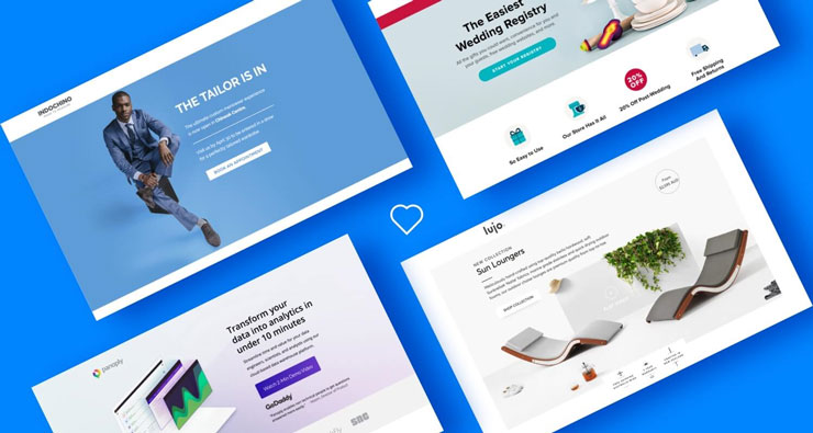
Visuals communicate faster than text. Use a high-quality image or video that shows the product, the outcome, or the experience.
- Product images: Show the product in use
- Outcome images: Show the result (e.g., happy customer)
- Videos: Explainers, testimonials, or demos
Pro tip: Avoid generic stock photos. Use real images that connect with your audience.
2.4 A Strong Value Proposition
Your value proposition answers the question: "Why should I choose you?" It's the unique benefit only you can provide.
- Example: "The only course that teaches AI-powered marketing with live mentorship."
- Example: "Save 10 hours per week with our automation tools."
2.5 Benefit-Driven Bullet Points
Bullet points are easy to scan and digest. Focus on benefits, not features.
- Feature: "24/7 customer support"
- Benefit: "Get help anytime, day or night"
- Feature: "100+ templates"
- Benefit: "Launch your campaign in minutes, not days"
2.6 Social Proof
People trust people. Social proof reduces risk and builds confidence.
- Testimonials: Quotes from satisfied customers
- Reviews: Star ratings and written reviews
- Logos: "As seen on" or "Trusted by" logos
- Numbers: "10,000+ customers" or "4.9/5 rating"
Pro tip: Use specific testimonials with names, photos, and results.
2.7 Trust Signals
Trust signals reduce anxiety and build credibility. Include them prominently.
- Security badges: SSL certificates, payment security logos
- Guarantees: Money-back guarantee, satisfaction guarantee
- Certifications: Industry certifications, awards
- Privacy policy: Clear, easy-to-find privacy information
2.8 A Single, Clear Call to Action (CTA)
Your CTA is the action you want visitors to take. It should be clear, prominent, and repeated throughout the page.
- Use action verbs: "Get Started," "Download Now," "Claim Your Free Trial"
- Create urgency: "Limited Time Offer," "Only 3 Spots Left"
- Make it stand out: Use contrasting colors and large buttons
- Repeat it: Place CTAs at the top, middle, and bottom of the page
Pro tip: Use one primary CTA. Don't confuse visitors with multiple options.
2.9 A Simple Form
Forms are where conversions happen. The simpler the form, the higher the conversion rate.
- Ask only for what you need: Name and email are usually enough
- Use clear labels: Make it obvious what you're asking for
- Minimize fields: Every additional field reduces conversions
- Show privacy reassurance: "We'll never share your email"
2.10 Urgency and Scarcity
Urgency and scarcity motivate action. They create a fear of missing out (FOMO).
- Time-limited offers: "Offer ends in 24 hours"
- Limited quantities: "Only 5 spots left"
- Countdown timers: Visual timers that create urgency
- Exclusive access: "Only for the first 100 subscribers"
Pro tip: Use urgency ethically. Don't create fake scarcity—it erodes trust.
2.11 Objection Handling
Address objections before they become reasons not to buy.
- Common objections: Price, time, trust, complexity
- FAQs: Answer common questions directly
- Guarantees: Reduce risk with money-back guarantees
- Comparisons: Show why you're better than alternatives
2.12 A Strong Closing Argument
End with a powerful summary that reinforces the value and encourages action.
- Recap the benefits: Remind visitors what they'll get
- Reinforce the CTA: Tell them exactly what to do next
- Create urgency: Remind them of the deadline or limited availability
- End with confidence: Show that you believe in your offer
3. How to Test and Optimize Your Landing Page
A landing page is never finished. Here's how to continuously improve it.
3.1 A/B Testing
- Test one element at a time (headline, CTA, image)
- Run tests until you have statistically significant results
- Implement the winning variation
- Repeat with the next element
3.2 Heatmaps and Session Recordings
- See where visitors click, scroll, and linger
- Identify friction points and confusion
- Optimize based on real user behavior
3.3 User Feedback
- Ask visitors why they didn't convert
- Use exit-intent surveys
- Talk to customers and prospects
3.4 Mobile Optimization
- Test your landing page on mobile devices
- Ensure forms are easy to fill on mobile
- Optimize images and load times
4. Real-World Example: The Landing Page Transformation
Here's how a digital marketing agency improved a client's landing page:
- Challenge: The client's landing page had a 2% conversion rate.
- Solution: They redesigned the page using the 12 elements. They added social proof, simplified the form, and created a stronger CTA.
- Result: Conversion rate increased to 8%. That's a 4x improvement—from the same traffic.
5. Conclusion: Build Landing Pages That Convert
A great landing page isn't about design. It's about psychology. It's about understanding what your visitors need and removing every barrier to action. The 12 elements I've shared—headline, subheadline, hero image, value proposition, benefits, social proof, trust signals, CTA, form, urgency, objection handling, and closing argument—are the building blocks of a high-converting page.
But here's the good news: You can start today. Pick one element. Improve it. Test it. Then move to the next. Small improvements compound into big results.
The choice is yours. Keep losing visitors to a poorly designed landing page, or start building pages that convert.
Join the best Digital Marketing Course to master conversion optimization and digital marketing in 2026.
Frequently Asked Questions (5 Unique FAQs)
❓ 1. What's the most important element of a landing page?
The headline. It's the first thing visitors see and determines whether they stay or leave. A great headline can dramatically improve conversion rates.
❓ 2. How long should a landing page be?
As long as it needs to be. Some offers require short pages; others need long-form content to overcome objections. The key is to provide enough information to motivate action—no more, no less.
❓ 3. How many CTAs should I have on a landing page?
One primary CTA, repeated multiple times. Don't confuse visitors with multiple options. One clear action is best.
❓ 4. How do I know if my landing page is working?
Track your conversion rate. A good landing page typically converts at 5-10% (or higher). Use A/B testing to continuously improve. Use heatmaps to see where visitors click and scroll.
❓ 5. What's the biggest mistake people make with landing pages?
Trying to do too much. A landing page should have one goal and one message. If you're promoting multiple offers or asking for too much information, you're reducing conversions.